K_1 – PACKAGING DESIGNBrand repositioning and packaging design for Prüvit’s next generation of products
BRAND IDENTITY
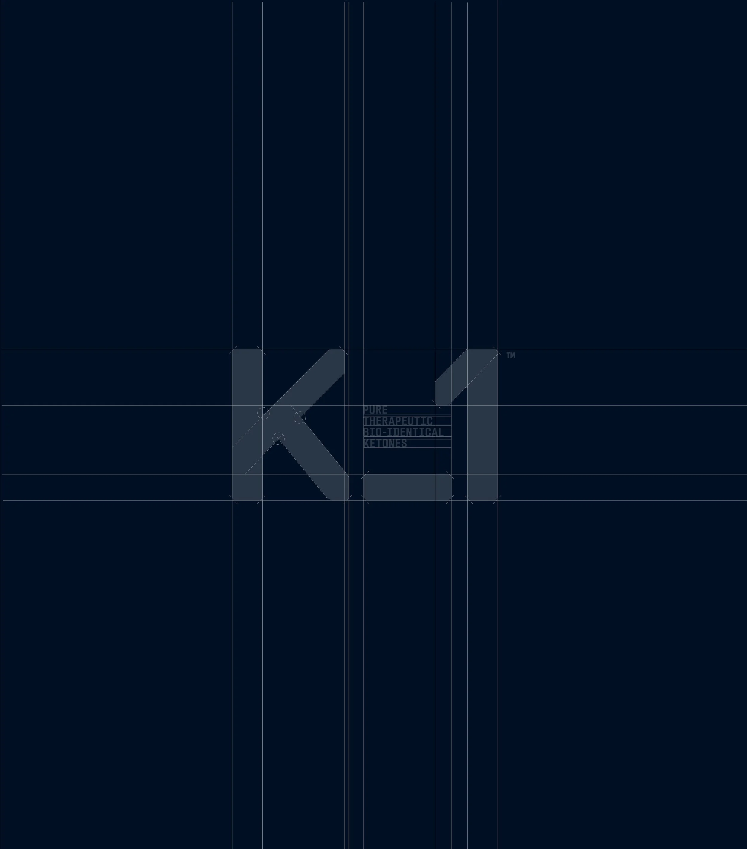
LOGO AND SYMBOLS
TYPOGRAPHY
SOCIAL MEDIA
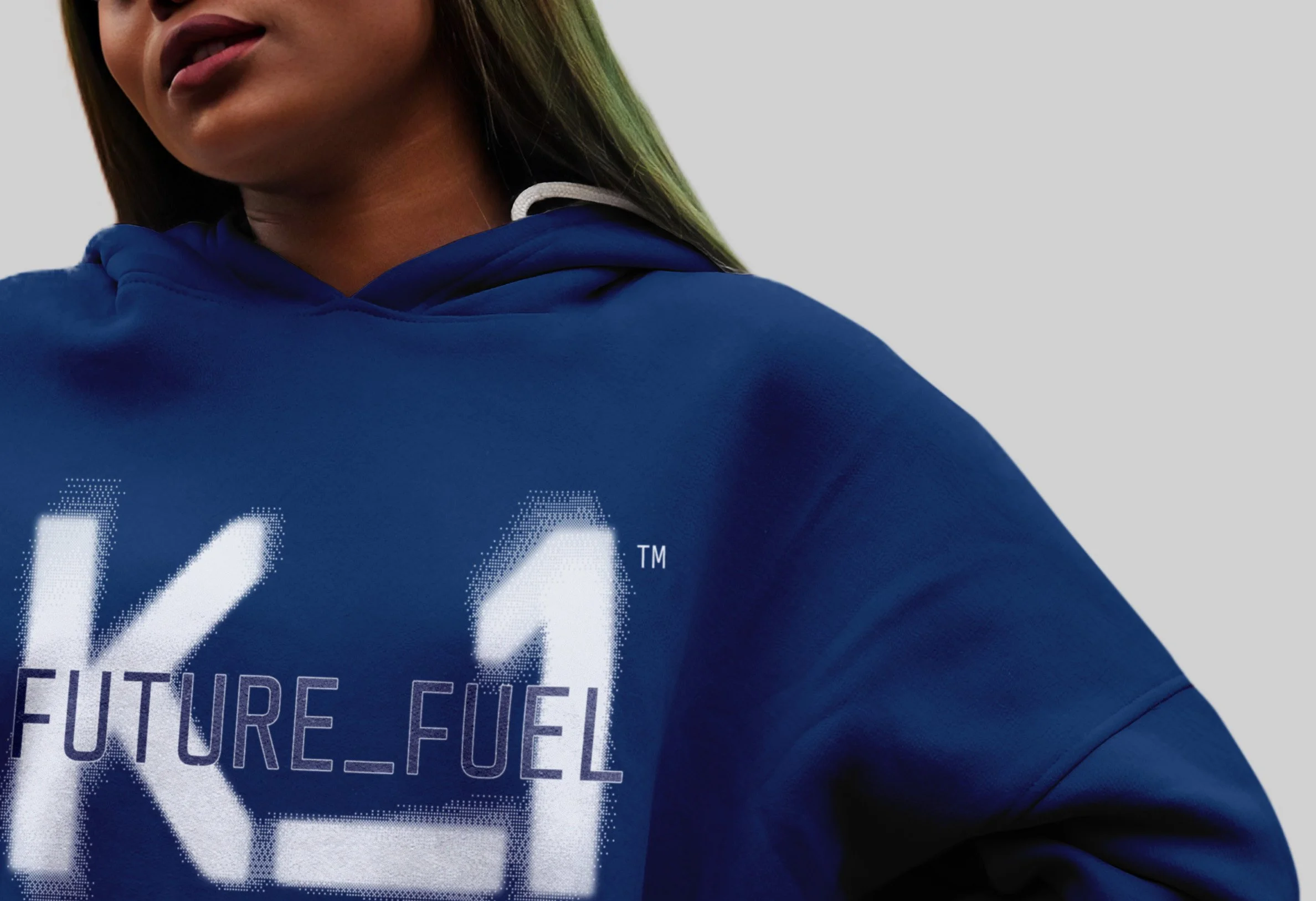
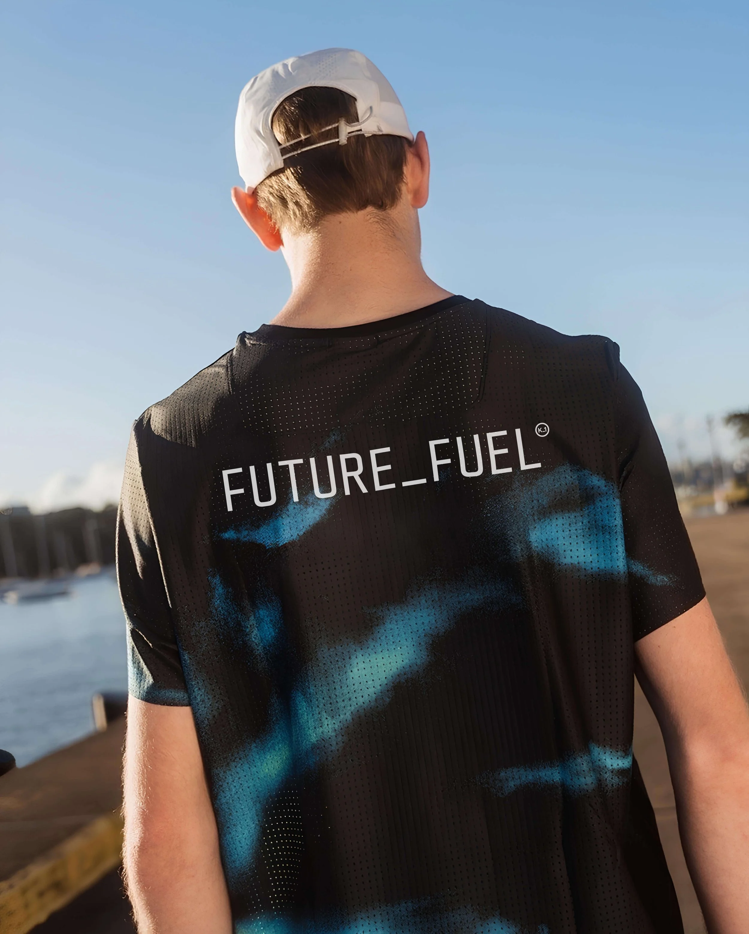
CLOTHING
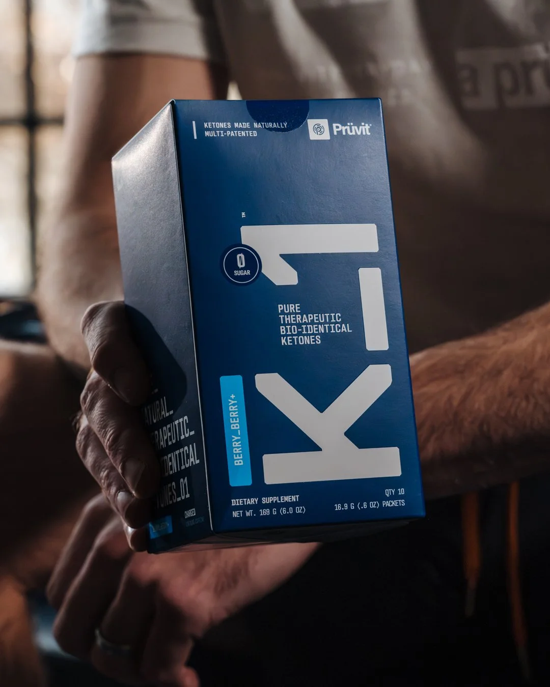
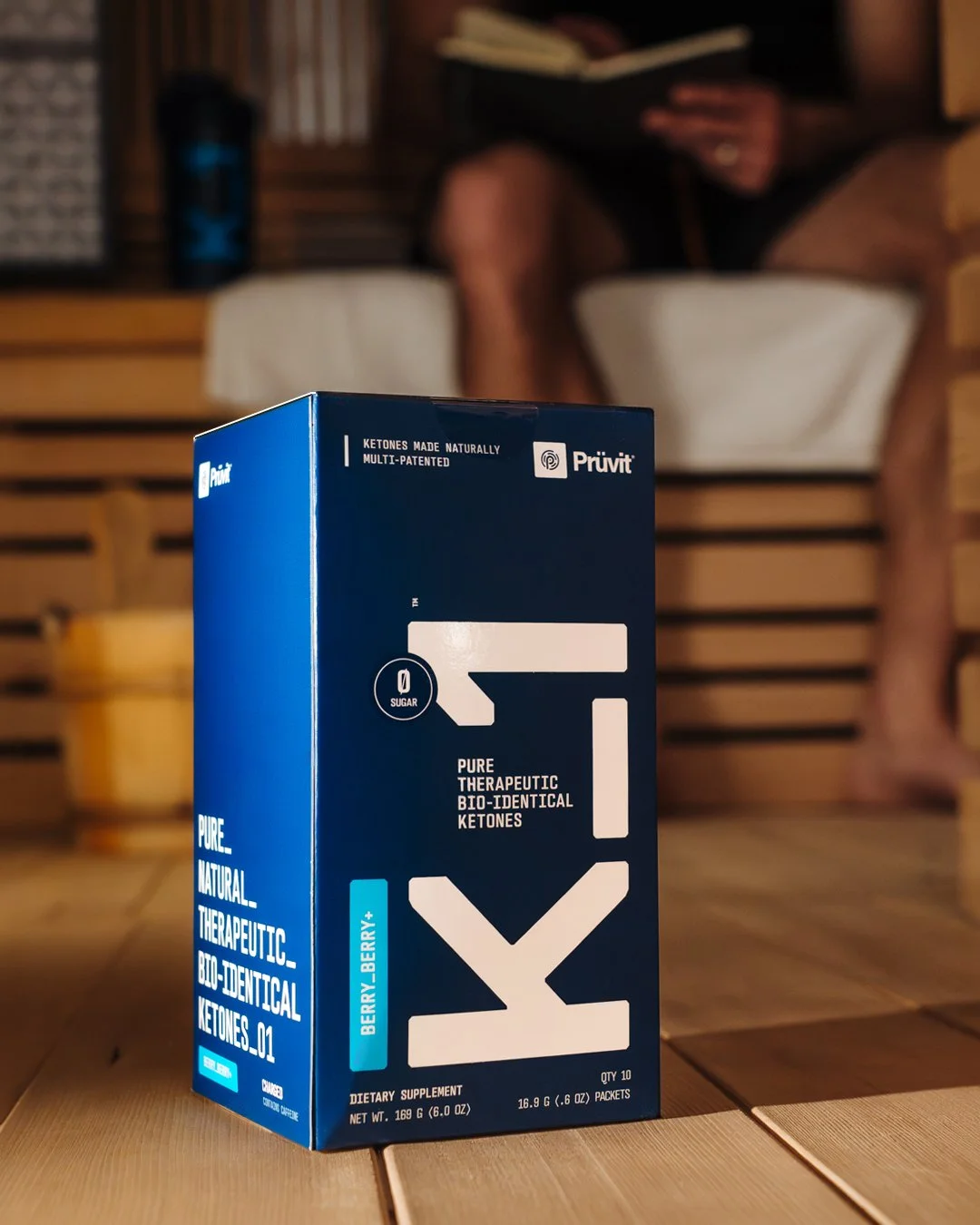
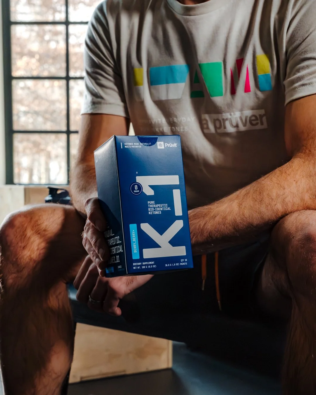
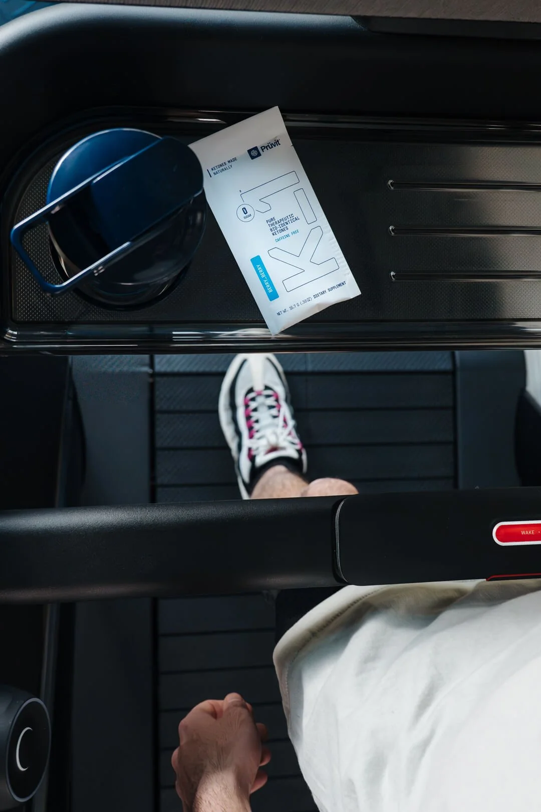
PRODUCT PACKAGING
THE PROJECT BRIEF
The existing packaging faced three key problems: an outdated look, brand perception diluted by countless flavours, and high production costs due to constantly changing designs. Taken together, this could be perceived by customers as a lack of innovation.
At the same time, an analysis of successful brands such as AG1, Huel and yfood revealed a clear pattern: a focus on a single product, minimalist design and a coherent brand identity. This led to three specific objectives — reducing product variety, sharpening the brand language and visually repositioning the product range.
DESIGN RESULTS
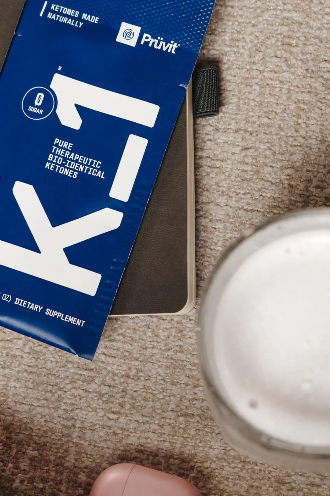
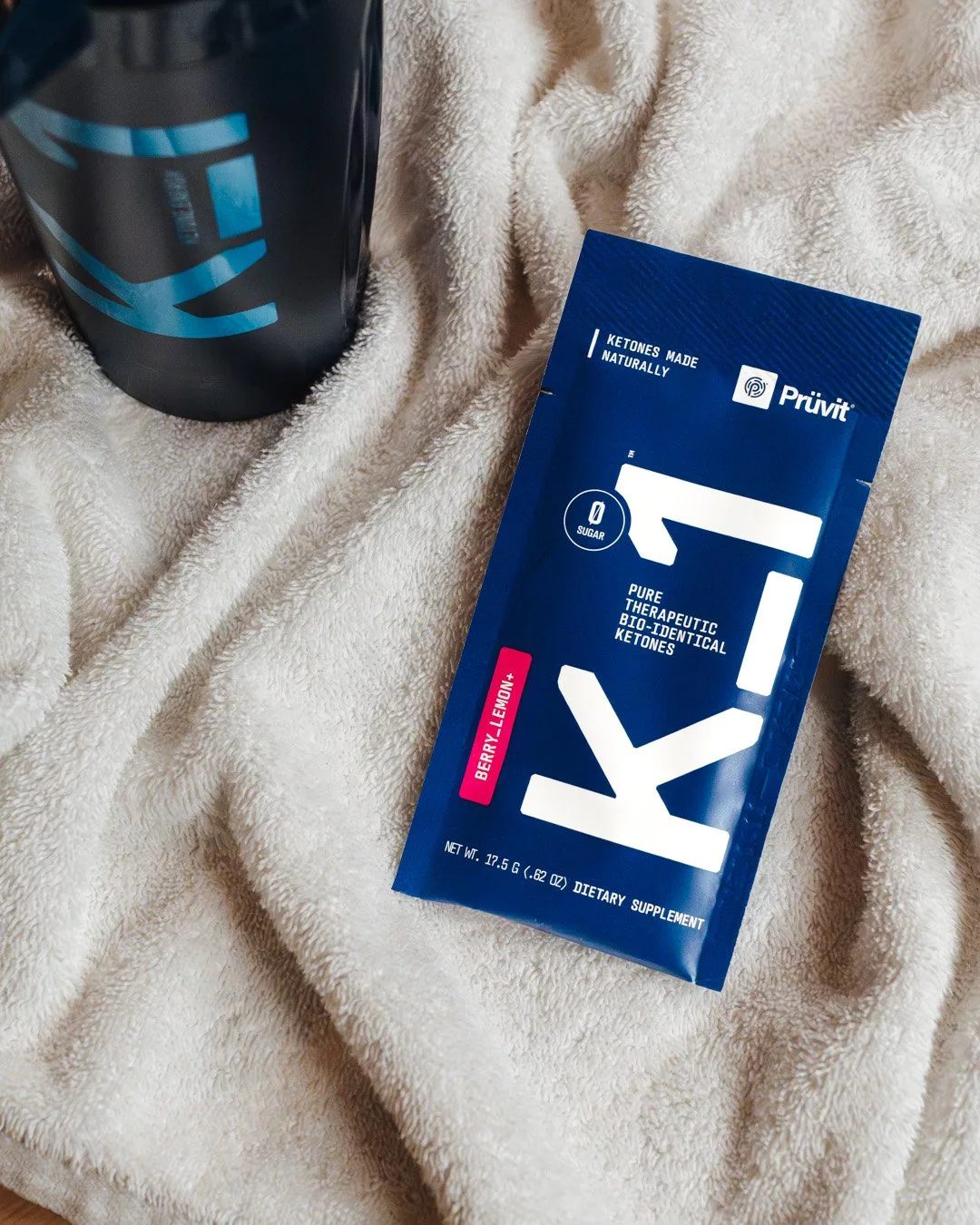
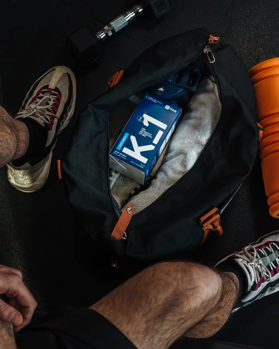
This approach gave rise to a scalable naming and design system: K_1 is conceived as the first in a potential product range (H_1, S_3 …) that can signify new stages of innovation without diluting the brand with a constant stream of new names. The finished product is now available as a sachet system featuring patented Tri-Blend ketone technology — an example of how strategic packaging design can underpin a complete brand repositioning.