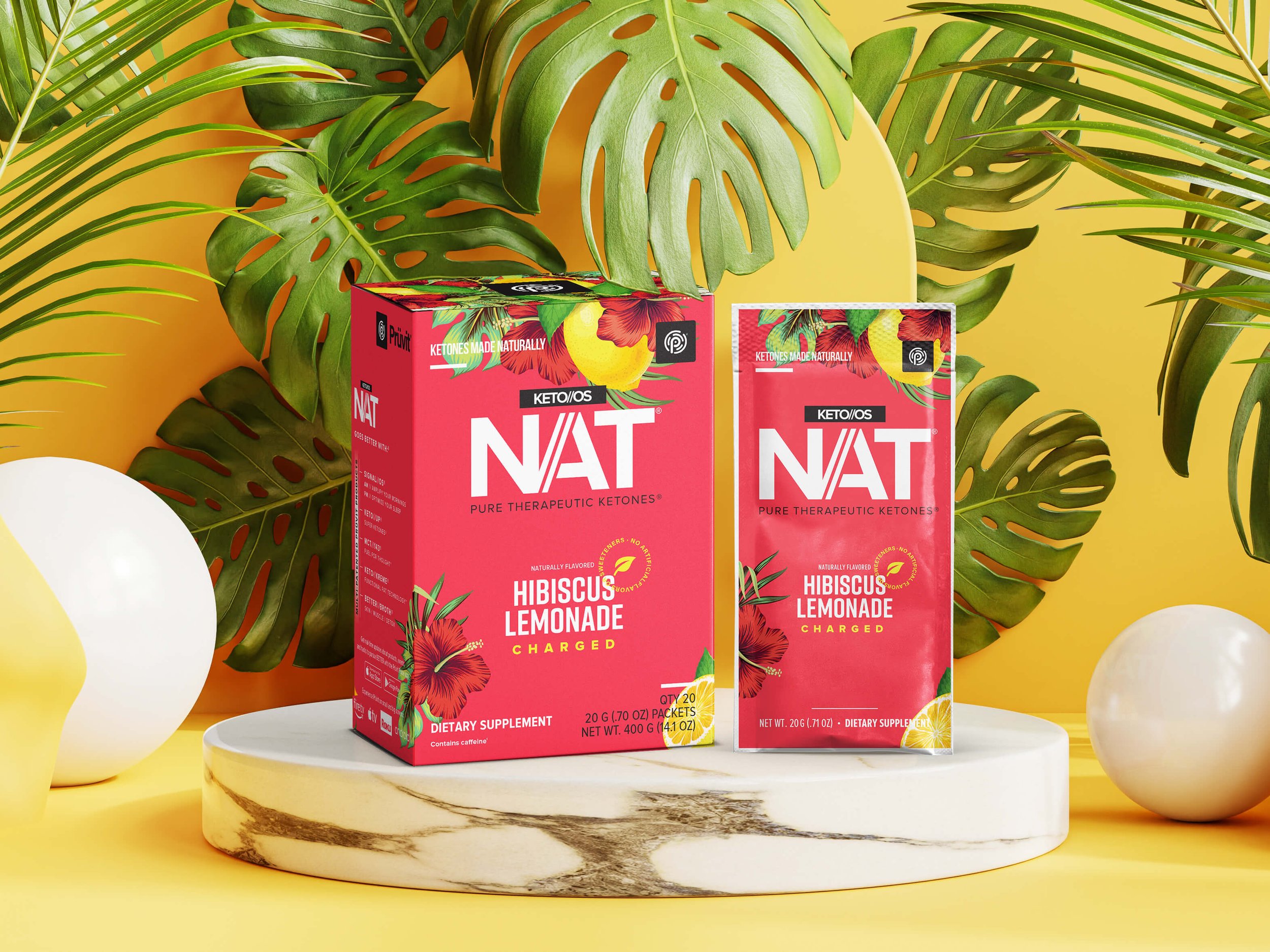
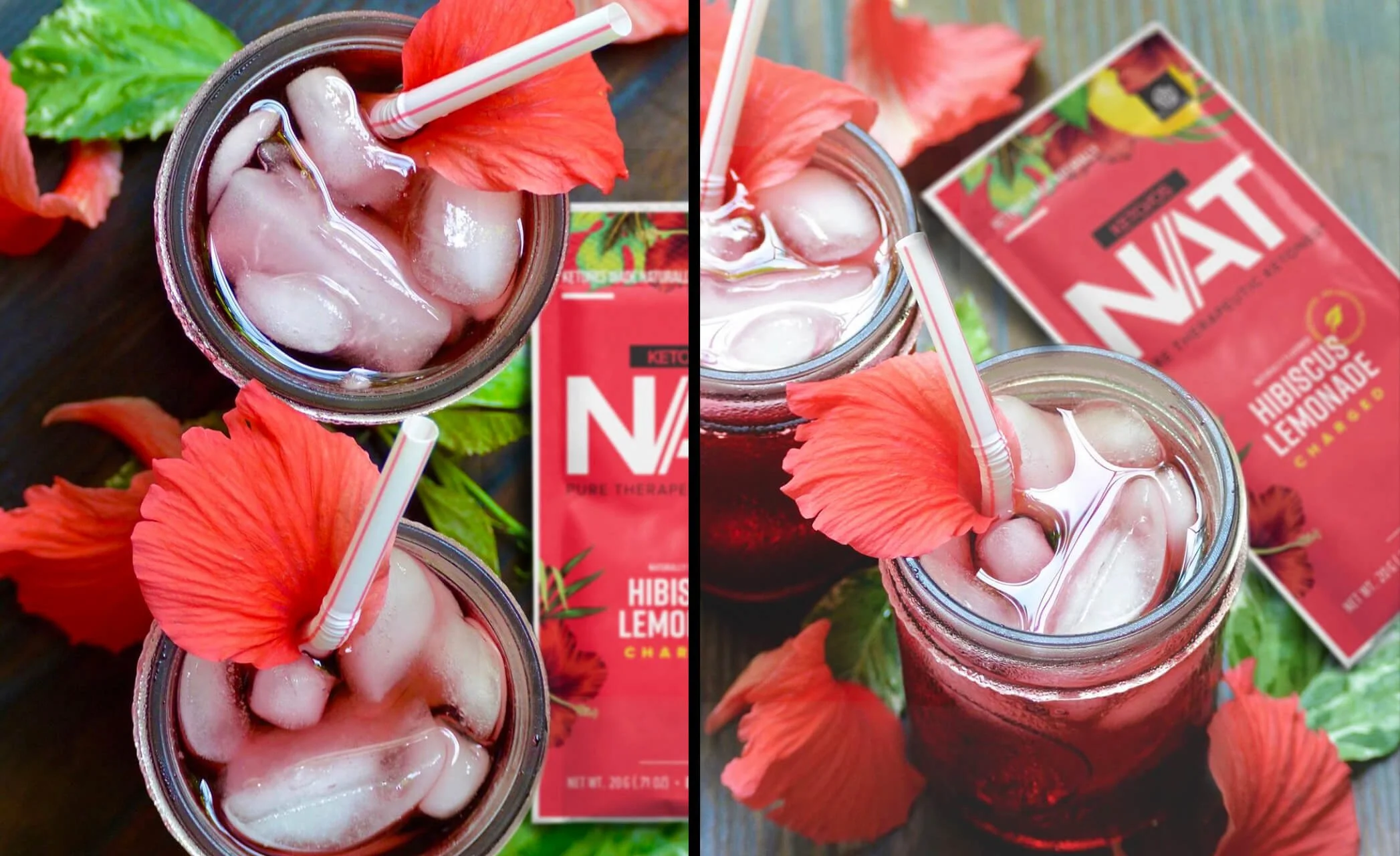
PACKAGING DESIGN
Bioavailable ketone salts through a naturally fermented process.
BRAND IDENTITY
LOGO DESIGN
PATTERN DESIGN
ILLUSTRATION
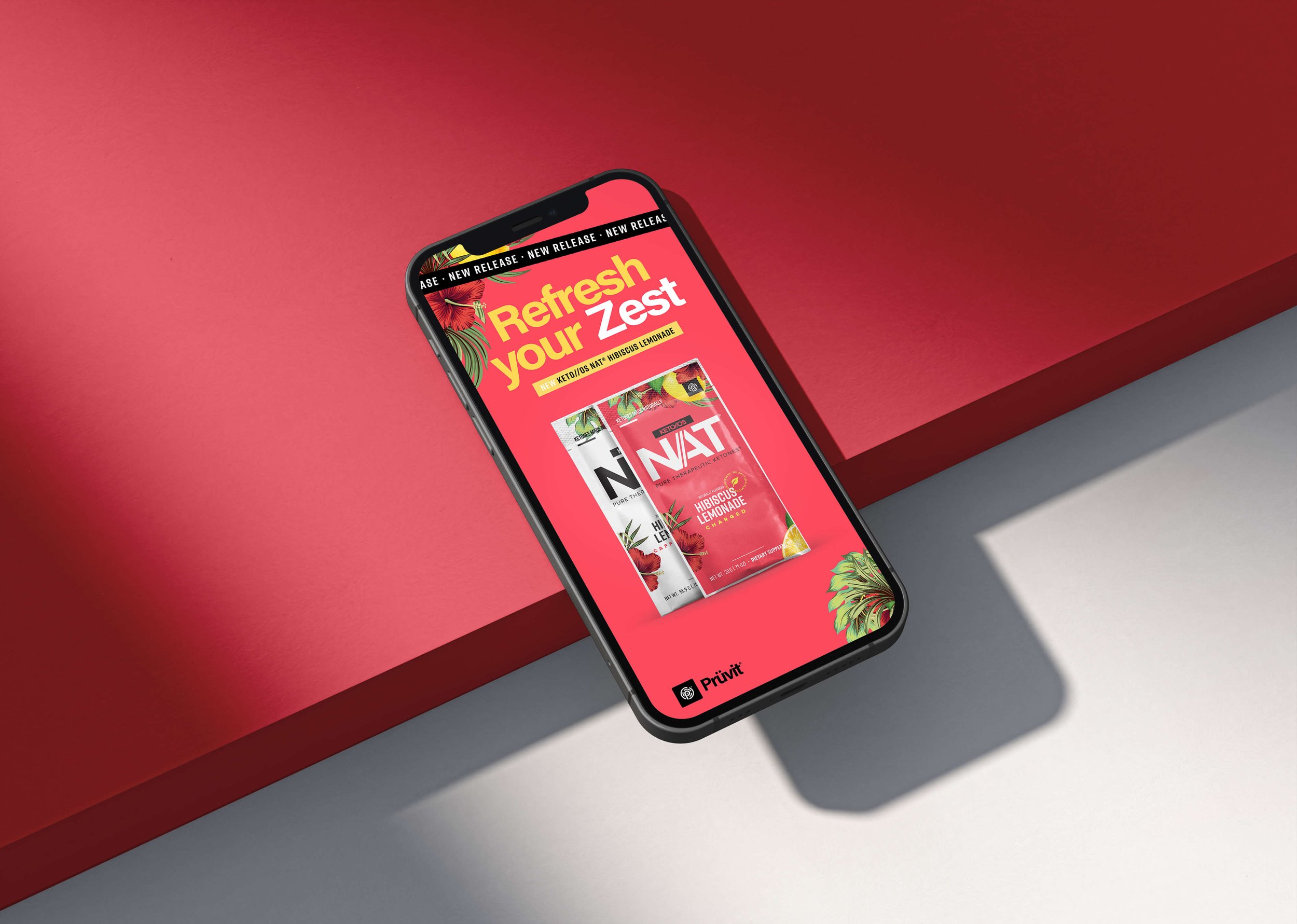
SOCIAL MEDIA CONTENT
THE PROBLEM STATEMENT
One of the biggest challenges in designing new product packaging is understanding and meeting consumer expectations. The packaging must be visually appealing, convey the product’s benefits and stand out from the competition. Furthermore, consumers often have preconceived ideas about the size, shape and material of the packaging, which are difficult to deviate from.
DESIGN RESULTS
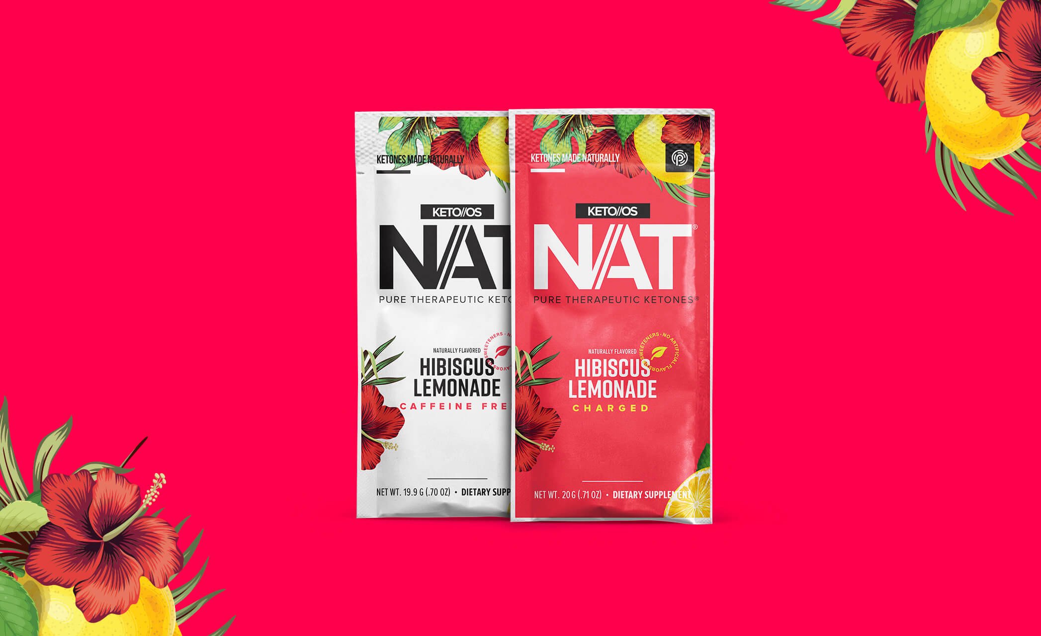
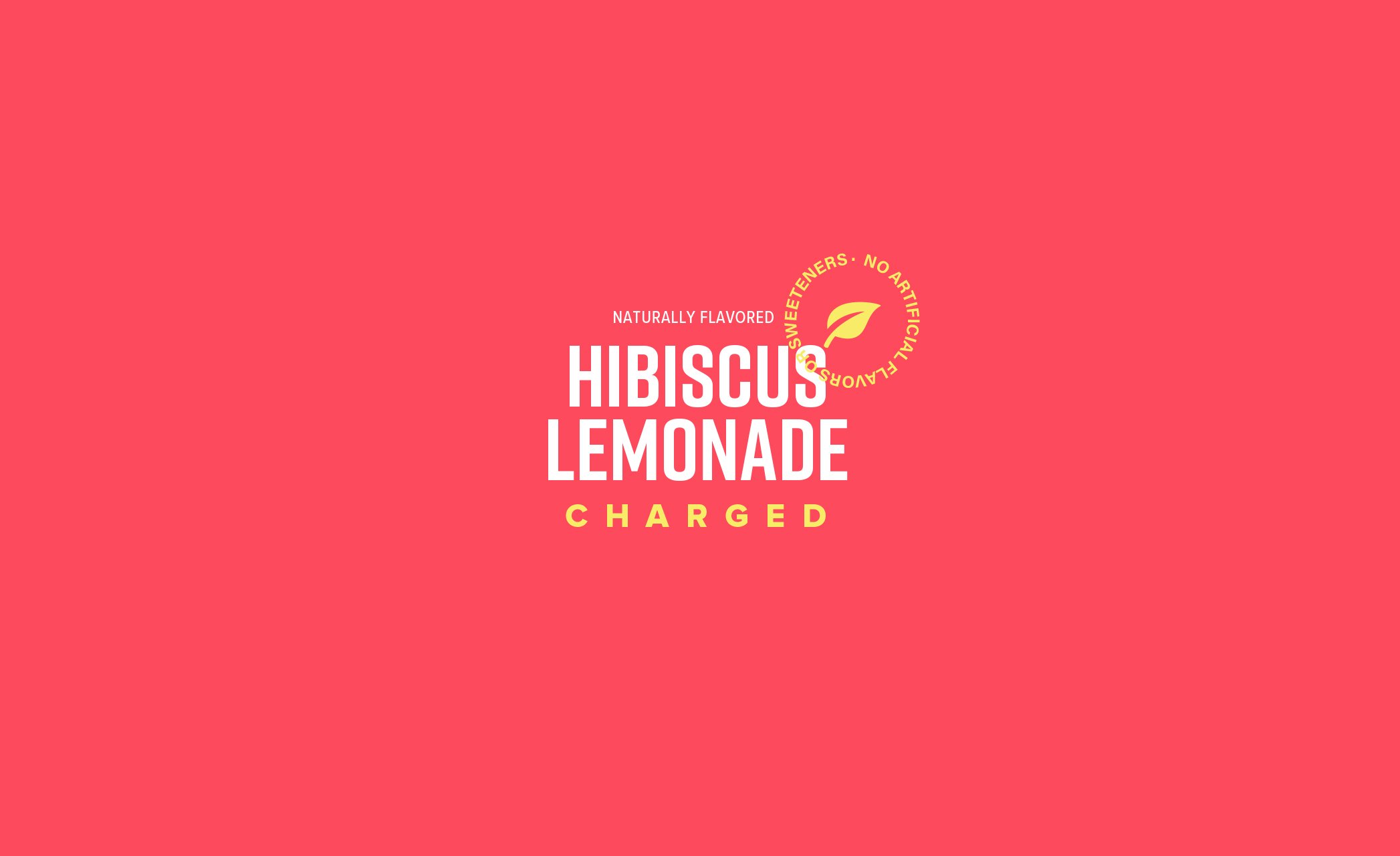
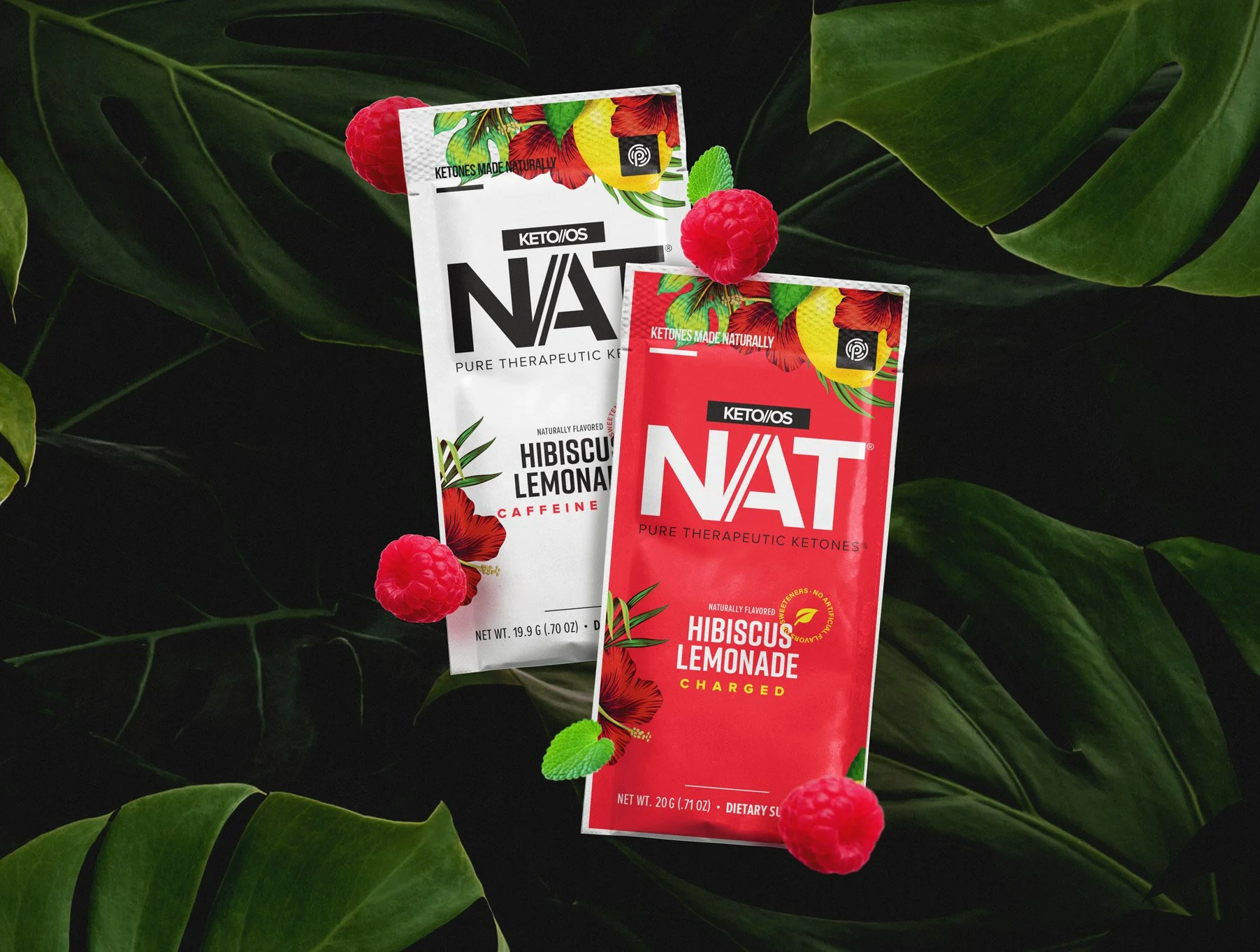
The NAT logo has been redesigned to maximise its impact. The hierarchy of the flavour and the information on the front of the pack has been streamlined and simplified to make room for additional visual elements that represent the flavour. A combination of bright, eye-catching colours has been used to convey the delicious, refreshing taste as well as the boldness of the brand and the product.